Rita El Khoury / Android Authority
Colors are beautiful. I love a pop of color, be it in my life, my furniture, my clothes, and yes, even my Android phones. I choose a colored phone and case when I can, I often pick colorful wallpapers, and I stick with the default icons instead of applying Google’s Material You unicolored icons (because I just want to find the app I’m looking for in the least amount of time). So you can imagine that the Nothing Phone 2’s black-and-white monochrome theme goes against every single one of those preferences.
And to be fair, I was convinced that it wasn’t up my alley at all. In every product picture and hands-on video I saw, I disliked the dot-matrix font, the 60s-throwback theme, and the lack of color. I thought it looked dull and boring. Well, that is until I got a Nothing Phone 2 in my hand and, well, I realized I had judged it too harshly. I was wrong.
Are you team monochrome or team colors?
44 votes

Rita El Khoury / Android Authority
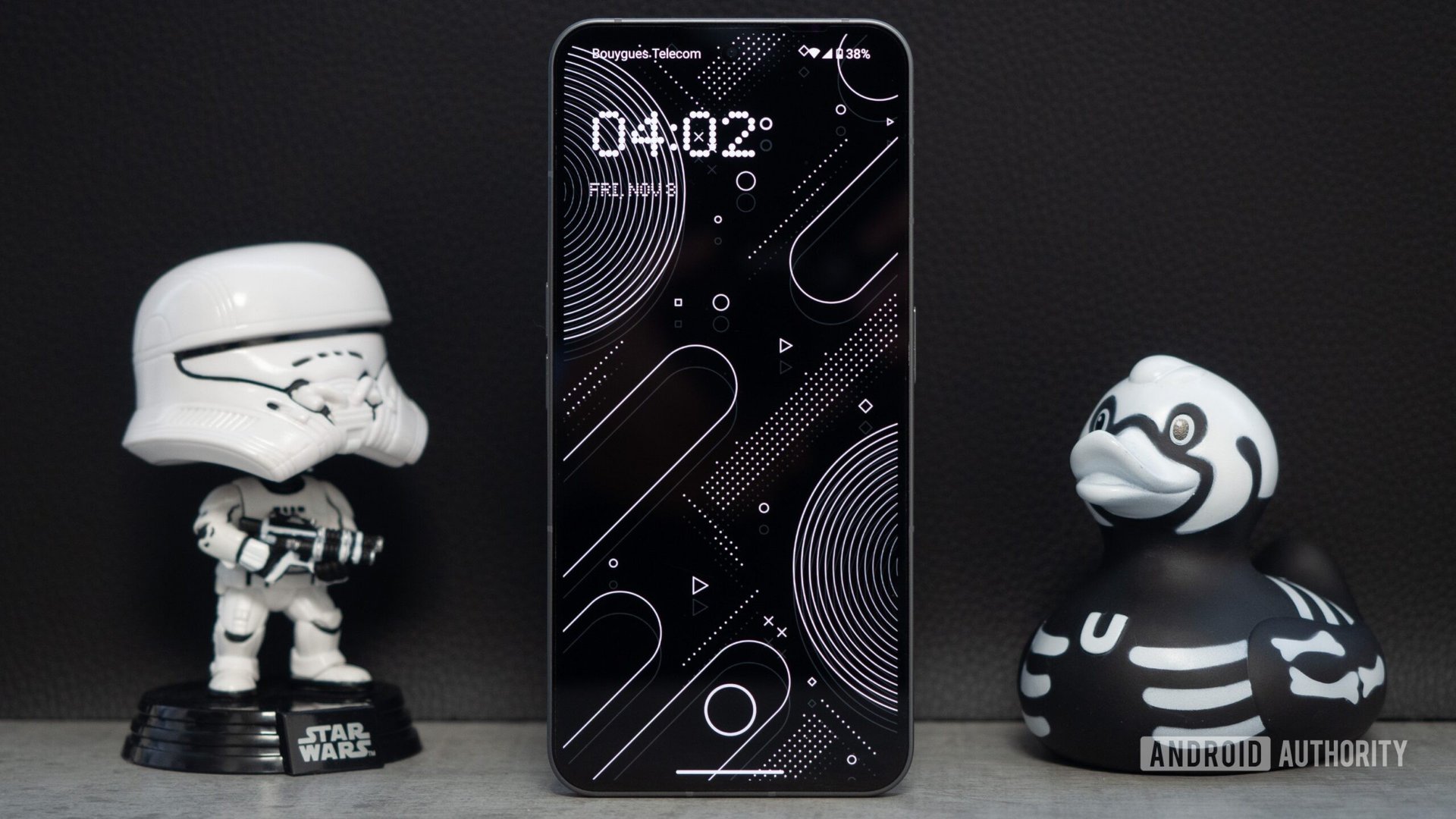
From the moment I set up the Nothing Phone 2 and was presented with a theme choice, I realized I could not pick the default Android look. That just felt wrong. As if I was desecrating the phone and Nothing’s entire engineer and designer team along with it.
The monochrome Nothing theme feels like a continuation of the Phone 2 — perhaps even an integral part of it. There’s something very clean and sleek about it. It’s minimalist, simple, and manages to marry modern iconography with dot-matrix fonts and widgets in a mix that shouldn’t work, but somehow does. In the same way that the Nothing Phone 2’s hardware marries funky retro-style LED lights with a modern smartphone aesthetic in a mix that sounds gaudy on paper but looks polished in person.
And the very small pop of red that you see here and there is all you need to break the theme’s monotony. I also really appreciate the lengths that Nothing has already gone to to make widgets, large app folders, and folder cover icons that fit with its theme. You can create several homescreen layouts before running out of ideas and widget options.

Rita El Khoury / Android Authority
Of course, not all app icons are themed and third-party widgets are just… whatever the developers decide. Once you get in the weeds of local, country-specific banking or shopping apps, for example, odds are the app won’t be themed by Nothing and you’ll find a colored icon in the middle of your black-and-white app drawer. You don’t even have to look that far, to be honest. Several of Google’s apps don’t get themed, like the Pixel Buds app. I guess you’re supposed to be using the Nothing X app with your Ear 2 buds instead.
Dig beyond the homescreen, though, and the limitation of Nothing’s influence on Android’s software design reveals itself. The default font, settings, notification drop-down, quick settings toggles, and many other elements are all still very much in the Material You camp — and the one that came with Android 13 at that. There’s no black-and-white theme here; the closest I could get is a very light blueish grey as a highlight color.
Rita El Khoury / Android Authority
But Nothing has already announced that Nothing OS 2.5 will bring Android 14‘s black-and-white monochrome theme, which will help mitigate part of the problem. Once that rolls out, I’ll be able to match the lock screen and home screen look with the rest of the phone’s software — apps, notification drop-down, quick settings, and all — for a more consistent experience. And the Nothing theme should feel right at home then.
Rita El Khoury / Android Authority
Until then, I’m still going to keep Nothing’s app icons and monochrome theme on the Phone 2. The color-thirsty part of me is a bit confused by this decision, but I think the Phone 2 changed my perception of monochrome themes. When they’re done well and in cohesion with the hardware, they can be interesting and, dare I say, beautiful. There’s a place for them and a place where they shouldn’t be. For instance, I can’t imagine running the black-and-white theme on my blue Pixel 8 Pro; that would go against the phone’s playful design. But on the Nothing Phone 2? Right at home.